ToolBar Tutorial
ToolBar(工具条)是一个非常常用的组件,它由org.eclipse.swt.widgets.ToolBar和org.eclipse.swt.widgets.ToolItem来实现。
先看一段示例:
    Display display = new Display();
    final Shell shell = new Shell(display);

    shell.setText("ToolBar Tutorial");
    shell.setSize(400, 400);

    shell.setLayout(new GridLayout());

    Group group1 = new Group(shell, SWT.NONE);
    group1.setText("Horizontal ToolBar");
    group1.setLayoutData(new GridData(SWT.FILL, SWT.BEGINNING, true, false));
    group1.setLayout(new GridLayout());

    final Image taskImage = new Image(display,
            ToolBarTutorial.class.getResourceAsStream("task.gif"));

    // Create a horizontal ToolBar.
    final ToolBar hToolBar = new ToolBar(group1, SWT.HORIZONTAL | SWT.FLAT
            | SWT.SHADOW_OUT);
    new ToolItem(hToolBar, SWT.PUSH).setText("Push");// Push style item.
    new ToolItem(hToolBar, SWT.SEPARATOR);// Separator, show only parent
                                            // style contains 'SWT.FLAT'
    new ToolItem(hToolBar, SWT.CHECK).setText("Check1"); // Check style item
    new ToolItem(hToolBar, SWT.CHECK).setText("Check2"); // Check style item
    new ToolItem(hToolBar, SWT.SEPARATOR);
    new ToolItem(hToolBar, SWT.RADIO).setText("Radio1"); // Radio style item
    new ToolItem(hToolBar, SWT.RADIO).setText("Radio2"); // Radop style item
    new ToolItem(hToolBar, SWT.SEPARATOR);

    // Create Drop down style item,
    final ToolItem dropDown = new ToolItem(hToolBar, SWT.DROP_DOWN);
    dropDown.setText("Drop Down");
    // Create a menu to show when the drop down item is expand.
    final Menu menu = new Menu(shell, SWT.POP_UP);
    for (int i = 0; i < 5; i++) {
        MenuItem menuItem = new MenuItem(menu, SWT.NONE);
        menuItem.setImage(taskImage);
        menuItem.setText("Item " + i);
    }
    // Add listener to show the menu for drop down item.
    dropDown.addListener(SWT.Selection, new Listener() {

        @Override
        public void handleEvent(Event event) {
            if (SWT.ARROW == event.detail) {
                Rectangle rect = dropDown.getBounds();
                Point pt = new Point(rect.x, rect.y + rect.height);
                pt = hToolBar.toDisplay(pt);
                menu.setLocation(pt.x, pt.y);
                menu.setVisible(true);
            }
        }
    });

    ToolItem[] tools = hToolBar.getItems();
    for (ToolItem toolItem : tools) {
        toolItem.setImage(taskImage);
    }

    Group group2 = new Group(shell, SWT.NONE);
    group2.setText("Vertical ToolBar");
    group2.setLayoutData(new GridData(SWT.FILL, SWT.FILL, true, true));
    group2.setLayout(new GridLayout());

    // Create a vertical ToolBar.
    ToolBar vToolBar = new ToolBar(group2, SWT.VERTICAL | SWT.SHADOW_OUT
            | SWT.RIGHT);// SWT.RIGHT makes text to display at right of image.
    new ToolItem(vToolBar, SWT.PUSH).setText("Push");
    new ToolItem(vToolBar, SWT.SEPARATOR);
    new ToolItem(vToolBar, SWT.CHECK).setText("Check1");
    new ToolItem(vToolBar, SWT.CHECK).setText("Check2");
    new ToolItem(vToolBar, SWT.SEPARATOR);
    new ToolItem(vToolBar, SWT.RADIO).setText("Radio1");
    new ToolItem(vToolBar, SWT.RADIO).setText("Radio2");
    new ToolItem(vToolBar, SWT.SEPARATOR);
    new ToolItem(vToolBar, SWT.DROP_DOWN).setText("Drop Down");
    ToolItem[] items = vToolBar.getItems();
    for (ToolItem toolItem : items) {
        toolItem.setImage(taskImage);
    }

    shell.open();

    while (!shell.isDisposed()) {
        if (!display.readAndDispatch()) {
            display.sleep();
        }
    }
    taskImage.dispose();
    display.dispose();
如图:

解析
关于ToolBar:
ToolBar是所有工具(ToolItem)的容器,可以是水平的(SWT.HORIZONTAL),也可以是垂直的(SWT.VERTICAL)。SWT.FLAT:用来设置要不要显示分割线(ToolItem(SWT.SEPARATOR))。SWT.WRAP:用来设置工具的自动换行。SWT.RIGHT:用来设置工具的文本(text)显示在图片(image)的右边。
关于ToolItem:
SWT.PUSH:普通的按钮。SWT.CHECK:多选按钮。SWT.RADIO:单选按钮。SWT.DROP_DOWN:下拉式按钮,点击箭头会显示下拉菜单。SWT.SEPARATOR:分割线,当且仅当ToolBar拥有SWT.FLAT风格时显示。setHotImage():设置一个当鼠标移动到ToolItem上时显示的图片。setDisableImage():设置一个当ToolItem不可用时的图片。getSelection()和setSelection():boolean类型的变量,只有对SWT.CHECK和SWT.RADIO有效。Selection事件:每一个工具(ToolItem)想要做什么事,全靠添加Selection监听来实现。一般情况:鼠标点击工具时立即触发。SWT.DROP_DOWN:鼠标点击工具时立即触发,当鼠标点击下拉箭头时,event.detail==SWT.ARROW,上面的示例中有用到。SWT.RADIO:因为RADIO是单选项,当一个RADIO被选择时,以前被选中的RADIO都会被取消选择,因而也会被动的触发Selection事件。
SWT.SEPARATOR的妙用
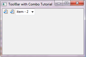
SWT.SEPARATOR不但可以用来显示分割线,还可以用来填充其它的控件。请看示例:
    Display display = new Display();
    final Shell shell = new Shell(display);

    shell.setText("ToolBar with Combo Tutorial");
    shell.setSize(300, 200);

    shell.setLayout(new FillLayout());

    final Image taskImage = new Image(display,
            ToolBarWithComboTutorial.class.getResourceAsStream("task.gif"));

    ToolBar toolBar = new ToolBar(shell, SWT.HORIZONTAL | SWT.FLAT);
    new ToolItem(toolBar, SWT.PUSH).setImage(taskImage);
    new ToolItem(toolBar, SWT.PUSH).setImage(taskImage);

    // 1. Only SWT.SEPARATOR can fill with a Control.
    ToolItem item = new ToolItem(toolBar, SWT.SEPARATOR);
    Combo combo = new Combo(toolBar, SWT.BORDER);
    for (int i = 0; i < 5; i++) {
        combo.add("item - " + i);
    }
    combo.select(2);
    item.setControl(combo);

    // 2. The width of item should be set to the minimum width of the
    // control, otherwise, the default value of a separator will be used.
    Point size = combo.computeSize(SWT.DEFAULT, SWT.DEFAULT);
    item.setWidth(size.x);

    shell.open();

    while (!shell.isDisposed()) {
        if (!display.readAndDispatch()) {
            display.sleep();
        }
    }
    taskImage.dispose();
    display.dispose();
如图:
注意:ToolItem的宽度(setWidth())一定要根据控件来重新定义,不然就会使用默认的Separator的宽度而导致控件显示不全。
参考资料:
* ToolBar, ToolItem snippets
* 如果想了解更多的关于设置颜色,字体等其它属性的相关内容,请移步至控件的通用设置
* 如果想了解更多的关于Layout和LayoutData的相关内容,请移步至布局管理器
* SWT Example: ControlExample
* Sample code and further information
Back to Home 上一篇:Tree Tutorial 下一篇:CoolBar Tutorial